In the world of WordPress, page builders seem to be the lastest craze. They promise, at least when bundled in a theme, golden and endless possibilities. The reality however is far from.
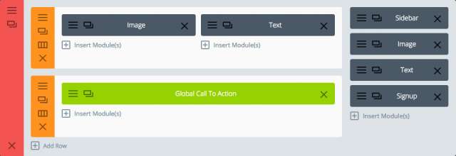
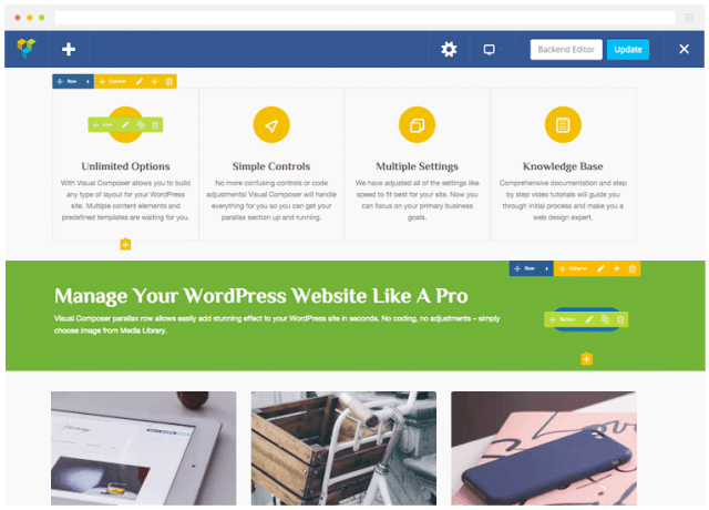
Page builders are plugins that take the normal big white content box in WordPress, turning it into a flexible area where you can add modules and components to your liking. Effectively letting you build a much more complex page than just a row of text.
So far, so good. I have previously written about why I think it is time we kill the dull old text page. But I have also written about the fact that we should be using structured data inputs, and separate design from content.
Too Much Design Control
Most page builders however simply give the user too much design control. For example, you can choose any background colors, any fonts, any margins and paddings. You can do too much.
What all this leads to, is that the end user is making design decisions. This is bad. It makes it incredibly difficult to create that seamless design which you are striving for.

At one point, choices about colors were made. You don’t have unlimited colors that your brand uses (and if you do, you’re doing it wrong). You have two, maybe three key colors and possibly lightness variations of them.
You also want your element spacing to be consistent across the site. Typography as well. Basically, you want a consistent design. Most page builders simply make this incredibly difficult.
Per-Section Styling Makes Maintenance Difficult
Another poor choice made by the biggest page builder plugins is to hard-code the section style settings by element or section. For maintenance, this is rubbish.
Say you, six months from now, make a slight alteration in your profile, choosing a slightly different color. Why yes, now you have to go through and update all the places you may have used this.
Compared to a modular approach, with a pre-defined purpose-based class or setting, this is tedious and impractical. It simply isn’t doing us any good.

Mixing Design and Content
As I alluded to in the introduction, design and content should be clearly separated. There are many reasons for this. The clearest one being device ubiquity.
In this day and age, we have a lot of different devices and tech companies are always trying to create the next big group of devices.
If we force design and content together, we have a massive task ahead once we need to get ready for a new device. It’s back to the drawing board.
When we separate the content into a meaningful data structure, we can simply pull the data out, and just create a new design for the new platform or device. Much easier than otherwise.
There Exist Good Page Builders
Sadly, none of the big page builders available in so many themes today I think hold the notion of being good. But many agencies are already working with page builder style tools, that gives partial control in adding the content, while keeping most design decision away from the user.
However, speaking about WordPress, there is no really good method for doing this yet in my opinion. Most methods currently available have some flaw that prevents them from being “really good”.
While this may be the case, we do however know how a good page builder would look like in theory. And it’s that theory that we are aiming for, and trying to evolve into creating.


